About this blog

In this blog I'm going to show you my watercolor paintings, and also the step by step for some of them.
I'm also going to share some of my digital artwork, 3d images created and rendered in Bryce.

I will post also some of my crafty projects and some pics of the place where I live, just for fun!
Hope you'll enjoy!!!

All images published are © Marissa Gabetta

Labels

watercolor (11) watercolor painting (11) art (8) dog (8) painting (8) custom portrait (7) portrait (7) demo (6) home (6) fun (5) face (4) step by step (4) lake (3) pet (3) pets (3) view (3) paper (2) review (2) test (2) 3d (1) Ikea (1) Marilyn Monroe (1) abstract (1) brush (1) color chart (1) drawing (1) food (1) pencil (1) sewing (1) still life (1)
Showing posts with label watercolor. Show all posts

Sunday, June 8, 2014

Tod in the woods - Beagle portrait demo

Here is another beagle portrait I was asked to paint. It was done on a quart sheet of Arches 300 grs.


Here is the start, cad red, UMB, "black", yellow ochre, raw umber, lemon yellow.


Slowly building up shadows and light. Started working on the eyes with sepia and burnt sienna.


Trying to achieve depth of color and facial expression.


Now it's time for the background. I did not like the one in the photo, so I decided that placing a blurred forest would do the trick. Used lemon yellow and indian yellow, viridian, and the same colors used in the fur.


adding more color and spattering for the foliage. Used sap green, viridian and neutral tint.


And here it is, finished!

Pin It!

Thursday, May 29, 2014

Zoe- Beagle portrait demo

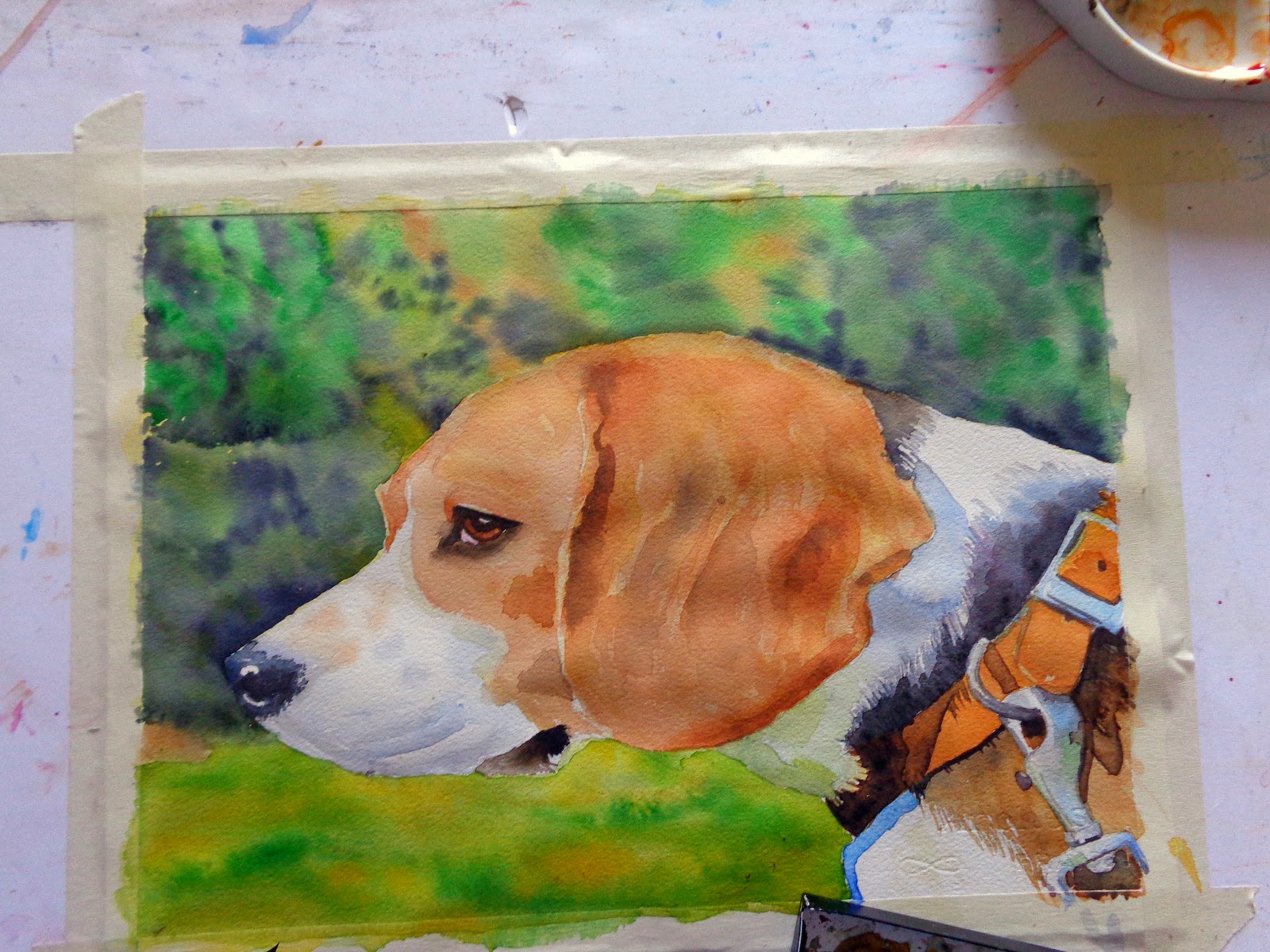
This is a portrait I painted for one of my friend's 2 beagles, her name is Zoe


I started with the dog, using yellow ochre and raw umber, plus a mix of viridian and purple magenta to get the black for the nose and part of the fur.


added some burnt sienna and translucent orange to the fur and burnt sienna and sepia for the eye. I'm working dry on dry softening some of the edges with water.


Started to do the background with cad yellow and sap green and some viridian, wetting the area first.


Always wet on wet, I painted the first layer of the distant foliage, using lemon yellow, some translucent orange and indian yellow.


I let the first wash dry, rewetted the surface and added neutral tint, sap green and viridian to give the impression of distant trees and bushes.


And this is the finished painting. I did some fine tuning on the hair near the mouth and retouched the metal stuff with some white gouache. Done!

Pin It!

Tuesday, May 20, 2014

Buddy's first portrait

More to the joy I'm sharing with my furry friend, I also got an irresistible will to paint again.
So here is the portrait I painted yesterday.


here is the first wash, I used UMB, permanent rose, translucent orange, indian yellow, yellow ochre, Van Dyke brown and burnt sienna


Used the same colors and mixed up some black for the nose using viridian green plus permanent rose


Using the same colors in the next layers, added sepia for the "eyeliner"


Here is Buddy inspecting his portrait..... :D


And here the finished work!

Pin It!

Wednesday, April 16, 2014

What a great afternoon!!!!

Spring is blooming everywhere, so I felt like painting in the open today.

I just drew a couple of ovals for the flowers, then I started painting very freely.


The sun was warm, there was breeze, how could I not stay in the sun???


I wanted to do this because, due to the sun and breeze, paper was drying quite quickly, not giving me the time "to think".
I had lots of fun, did not think about the final result.


Here it is, fresh and joyful! :)

....Note to self: do this more often!

Pin It!

Wednesday, March 12, 2014

Garza papel paper

I had a chance to test one of the 2 samples I received from Garza Papel, and more precisely the one weighing 180 grs 14 x 20 cm.


The paper arrived fairly quickly, and very nicely packed.
This is handmade paper, manufactured with 100% recycled cotton.


I'm not used to painting on such a small size and wanted to achieve no masterpiece. I also never used that paper weight before, I always use 300 grs because it has more strength and has less buckling after you wet it over and over.


What I noticed apart from the extreme whiteness, is the tooth, a very different texture compared to Arches' that I normally use.
The photo here shows some blue hue due to the morning light.


This is how the paper looked like after applying the first wash, nearly no buckling at all.
The feel whilst using the brush was of softness, yet a good roughness to help particular brush strokes.


This is the finished test.
I really used lots of water and many washes.
As you may see, the paper got minor buckling, compared to the relatively light weight of the paper.


I must say I'm really satisfied, looking forward to trying the 300 grs sample.
Definitely will get some sheets when I run out of  my Arches stock. Not much price difference, slightly more pricey, but still affordable. And top quality.


Pin It!

Wednesday, February 12, 2014

A baby portrait step by step - Sweet Lily

This is my latest commission, I already had made a portrait for Anne-Marie when she had her first child, now a baby girl arrived, and she kindly asked me to  make a portrait for little Lily.
So here I am, showing you the step by step process. The painting is made on half a sheet of Arches 300grs and used mainly Schminke transparent watercolors.

So here we go....

Step 1

These are the colors I chose for the background, W&N Antwerp blue and Schminke purple magenta.
Plan ahead and have all your stuff ready, prepare your colors in bigger quantities than you think you will need. It is a drama if in the middle of the painting you run out of color and have to mix more.....


The small brush with the opened up point is a very old brush I used 30+ years ago to paint on porcelain.
NEVER throw away old worn out brushes, they may be very useful for particular effects, I use this one especially for hair, eyelashes and eyebrows, it's just perfect!


So here is the first glaze on the background, wet on wet, I don't want it to be uniform, it would be boring, and in the ref. photo the baby is laying on a cotton towel, maybe mommy just changed her diaper, that's why she's smiling.......
I masked some hair on the front, the highlight on her right eye and on the tip of her nose. the paper is mounted on a gator board with masking tape that will also provide a nice edge to the painting.


Here is the second glaze on the background, this is a baby portrait, so color must be built up very slowly, no harsh changes of colors, I did some splattering when still wet.
I did the underpainting of the shirt using a cool yellow (aureolin) and a warm one ( indian yellow).


I used the same yellows to do the baby face underpainting, wet on wet (you may see the paper is still buckling in the photo).
To me, making the underpainting in (very diluted) yellows helps to give life to the colors that will be layered later.
Aureolin for the part of the face in light, and indian for the shadow areas.


I began working on the shirt, wet on wet. The sirt reflected here and there the skin colors, this is why I put a pinkish color on a white shirt.
And to me white is never "white"......


With the second glaze on her face, I began to give a "tridimensional" look, to shape it


The first layer of skintone: this will be used in all the following steps, varying the quantities of this or that color. Keep in mind that this is a baby with pale skin, so no harsh colors.
Anyways the colors I used here are: purple magenta, ultramarine finest and translucent orange, all by Schmincke.
I also mixed up some alizarin crimson and phtalo green (not blue, it was a typo)  to get a grayish color and painted the whole eyes with it.
At this stage poor Lily looks like a baby alien, but it will come together....


One more layer on the backgound, and some more working on the face.


More work on the face and the eyes where I used some toned down UMB for the pupils amd irises.


Still working on the face.....began painting the nostrils, which cannot be too dark, and on the lips, which are very challenging because they must not end up like she's wearing a lipstick, but they are naturally very pinkish


Slowly defining the details and the shadows........


Glaze over glaze, it is coming together. This is the slow part, as the paper must be bone-dry before applying the next glaze, and I don't use a hairdryer as I don't want to move the color on the paper....working more on the eyes, where I added some W&N blue green shade and indigo.


.....slow but steady progress.....


Been working more on the fine hair, lips eyes and "wrinkles".
Added a very diluted ruby red wash to her cheeks and tip of the nose.
Working very carefully on the lips.....


Nearly there...... :)
I removed the masking fluid and worked some more on the eye creases and the lips.
I also added some W&N blue green shade to the background to the left of her face


Done!!!!!
I'm very happy with the result, now for the part I like the most.....


.....removing the masking tape from the painting! :D


So here she is, Lily in all her beauty!!!


Hope you enjoyed this step by step and found it useful, pls let me know!!!

Pin It!

Tuesday, February 4, 2014

Color charts

One of the things I treasure are these lists I made of the colors I have. They come in handy very often if, let's say, I need a non staining color for my composition.
I took the time to write down all the characteristics of each one: lightfastness, transparence/opacity, pigment code, staining or not, granulosity if any, and if they are cool of warm.
They may not be perfect, but they are absolutely worth the time!!!


One more thing I did was this chart where I put the yellows/blues combinations to have a handy guide for mixing greens; this is also very useful and saves you much time when mixing colors, and pleasant greens are the most difficult colors to get, so at a first glance I can get an idea of what I need, without spending lots of time (and of colors) trying to get what I need.


I did the same with purples (purple is my fav color)

On my to-do list is a chart for grays..........

I also did a sample for water resists, to see how they behave....the last one is wax crayon, I forgot to add


So take your time, take your colors and do your charts....and have fun!


Pin It!